Guide: Positioning things
Positioning is fully controlled by FlexContainers.
⚠ Positioning is only one part of Layout; see either Quickstart: Layout with UI or Quickstart: Layout with script for guides on how to create a new layout and configure it.
Decision: fill the space
FlexContainers always start by calculating their own size, and then the sizes of their children (see Guide: Sizing), and then trying to fit their children into themselves. Where this leaves excess space, they try to expand (grow) their children to fill it, and where there isn't enough room for their children they try to reduce (shrink) their children's sizes until they all fit. This is controlled by the 'grow' and 'shrink' properties on each child's FlexItem component.
Options: Justify, Align, etc

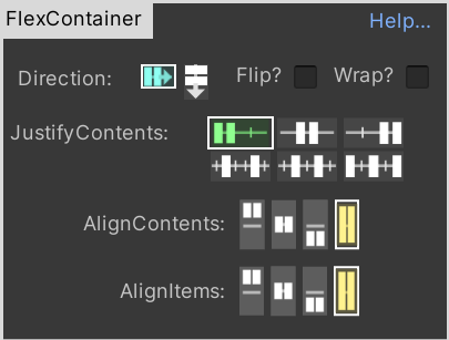
One of Flexbox's great strengths is that a small number of settings enable the full variety of layouts we see in the web and application UIs. The two key parts are Justify and Align.
Justify: "flex-justify"
Justify sets the positions of each item in the FlexContainer's current layout-direction (either Row or Column). Align does the same for their positions in the 'other' axis. i.e. if the FlexContainer is set to Row, then it positions its children horizontally (in a row), and Align controls the positions vertically.
Align: "align-items" and "align-content"
align-content is for WRAPPED containers
Note: "align-content" is IGNORED unless you enable "Wrap?" first (this is part of CSS's design).
When you have multiple lines of content (e.g. a FlexContainer set to "ROW", and "Wrap", with many children), Flexbox first looks at the value of "align-content". This tells Flexbox how to divide vertical space among the multiple rows of children.
align-items is for ALL containers
Then, within each row of children, Flexbox uses "align-items" to fit them into that row. Each child can override its "align-items" value, on a case-by-case basis (select the FlexItem in Unity and you'll find an option "Flex Overrides: align-self" or similar).
Both together
To see how the two interact, either create a FlexContainer with WRAP enabled and many children, or read up on these concepts in CSS/web, e.g. this one that has visual images showing how the two settings work together: https://blog.bitsrc.io/mastering-css-properties-a-deep-dive-into-align-content-justify-content-align-items-and-342c47858ea8
Padding and Margins
Margins are applied to a FlexItem itself (they force siblings to be pushed away from it by that amount).
Padding is applied to the children of a FlexContainer (it forces children to be pushed away from the internal edges by that amount)
🚧 In a future release "Padding" will probably be moved from the FlexItem to the FlexContainer - it was a historical accident that it got stored in the UI for FlexItem. It doesn't have any meaning on FlexItems, only on FlexContainers.
When to use Padding vs Margins
The FlexContainer's Padding is approximately equal to the child-FlexItems' Margins - except that Padding is only applied to the inner edges of the FlexContainer, whereas Margins are additionally applied in-between each item.
However there's a special case where the difference becomes important: non-Flexbox items. This happens most often when adding background images to parts of your UI.
If you take a FlexContainer, and add a background image of e.g. a picture-frame to it (add a child GameObject WITHOUT a FlexItem/FlexContainer, with an Image component), and set that child to filly fill the FlexContainer (using RectTransform settings), that background image will fill the whole Container even as it resizes.
... now if you set a Padding on the FlexContainer, equal to the width of the image's visual border, and add child FlexItems, it will appear as if they are contained within the image. The Image will resize, the children will reposition, as the main FlexContainer resizes, but everything will appear correct.