Templates
FlexTemplates are 1-click buttons that will do common tasks for you. e.g. "Create a horizontal area and pre-fill it with Buttons", or e.g. "Add a Header, a Footer, and a sidebar".

Installing/enabling - 2023
Basic templates will auto-install from the UnityPackageManager when you install the main FlexBuilder package. If you accidentally remove the package, re-install the full FlexBuilder package from the asset-store.
Advanced templates are available as separate packages from the AssetStore, or as part of the FlexBuilder-PRO bundle - follow the instructions in the bundle to install them.
Custom/proprietary templates you manage yourself, either as optional packages, or as assets directly inside your project.
Core Templates
There are a few templates that are frequently used:
| Icon | Name | Description |
|---|---|---|
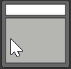 |
Header + Body | Classic layout: a header which automatically sizes to the height of the Text inside it, and a Body which you add all your other UI to |
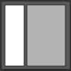 |
Sidebar (left) | Classic layout: a sidebar on the left, set to a percentage of screen width or fixed number of pixels |
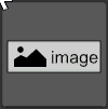 |
Image | A UnityUI Sprite/Image added as a child, can be centered, stretched, etc |
Using Layout templates
You can (and indeed: you should!) nest layouts inside each other. After a layout is created it is nothing special - it's just an ordinary set of FlexContainers and FlexItems.
Note
💡 In FlexBuilder-Pro the 'layout templates' are a bit smarter, and can be used to 'change' an existing layout; docs on this coming soon, or check with Support on how to use/enable this.
TextMeshPro and choosing the right Text templates
Most templates that add Text, or text-based UI (e.g. Buttons) have two versions:
- A standard version using UnityUI.Text
- An extra version using TextMeshPro
The versions that use TMP have a yellow label in the top right of the logo to make them easy to spot.
You can show/hide "only TMP templates" or "only UnityText templates" by clicking the buttons at the bottom of the templates area.
Using Images
Note
💡 The "Image" template will intelligently try to modify the parent FlexContainer if it's the only child within the container. It will override Flexbox's default ("stretch to fill") and replace it with "center" so that the image retains its default size + aspect ratio.
If you use the Image template on a container that already has children, FlexBuilder will NOT try to change your existing settings - so if you haven't changed them, the Image will get stretched (Flexbox's default)
Advanced Features
Configuring and/or hiding individual templates
Templates are configured in the "NinjaTools.Templates for FlexBuilder" package. Within that package are a set of Unity Assets (ScriptableObjects), one for each Template:
If you edit these directly you can:
- Disable a template (so it doesn't appear in the FlexContainer)
- Change the display-order (so it appears near the top or bottom)
- Change the icon (if you really want?)
Changes are picked up immediately and automatically in-Editor. However your changes will be lost when you upgrade. If you need to customize them and have the changes survive across upgrades, look at the section on "Creating Custom Templates"
Note
💡 A future update for FlexBuilder-Pro will enable you to persist these changes across upgrades automatically
Creating Custom Templates
You can also create your own templates. Each template needs an Asset (ScriptableObject) instance of one of the Template classes, currently:
- Class: IAddFlexItemTemplate
- Class: IChangeFlexContainerTemplate
FlexBuilder will discover these wherever they're located in your projct (you can put them in Assets).